top of page

You know what they say about New York City "If you can make it here, you can make it anywhere".   It is a place of opportunity.  Just ask the heaps of people who are tempted to move here and the millions who are already here despite the crowd and the cost which are most often overlooked because the pros are too hard to resist. 


No matter which neighborhood or borough you live in, #NYC always has something to offer no matter what time it is, all year round - day in, day out. You can go on for months not going to the same restaurant twice.  You can walk to Times Square every single day and you would never have the same experience.  The art and culture scene are just unmatched.  From the museums, to the gorgeous libraries, to the broadway theaters, to the night life,  there is no reason to stay home and do nothing in the city that never sleeps.  

Then the pandemic hit.  New York City became the epicenter of the #Covid-19 virus.  In one instant,  the city that never sleeps took a pause, a long pause...  People who are transplants cried their way back home and us real New Yorkers resiliently stayed and hoped for the best.


Months went by and all I can do was stare at the walls of my place.  I'm lucky enough that I live in a spacious 3 bedroom & 2 bath near Central Park.  A walk in the park kept me sane.  But being at home 24 hours a day, 7 days a week I couldn't help but notice every uneven wall, all the chipped paint, the unmatched pillow cases,  the rusty nails on the chair.   I had the urge to fix everything, to paint all the walls, to change my whole interior. 

And then just like that, REIMAGINING SPACES was born.  


Updated: Dec 8, 2022

Shelves aren't just for books, or photos, they are also a great way to store your shoes in them!


When you live in Manhattan like I do, you try to utilize every space that you have. Every square inch counts! Storage ideas for small spaces, vertical is always the way to go. Not only do they look more organized, it also maximizes the vertical space (think all the way up to your ceiling) in your home or apartment for maximum space efficiency.


I saw this photo online from The Container Store and I thought what a great idea but then when I saw the price tag of almost $900, I choked for a good second then I thought I should probably build something similar myself for less than half the cost.


And so I did!! I had this blank space when I open my door to my bedroom and it really was wasted space if I didn’t do anything with it. So that's where I decided to do my shoe wall.


I was not able to take a great photo of the BEFORE but I’m sure you can figure out from the below video how it looked like bare. Here is a video tho of myself after I already added a few shelves on the wall. I measured both sides of the wall first to figure out how long I want my shelves to be. Then I went to Home Depot to buy some plywood and cut them to the measured size. I used medium size brackets to hold the shelves.


After all the shelves were installed, I started painting. I painted everything in white so it looks very clean. I just used the regular Benjamin Moore semi-gloss white paint.


And once the shelves were dry (I waited 24 hours) I started putting the shoes that I am currently wearing and would be wearing for my planned vacation for the next couple of months. Unless some of these pairs get demoted and new pairs come in. Hey, spring is coming soon. You just never know :).


You won’t see my sneakers here as I put them in a different closet so not all my shoes are here. Yes I know I have way too much! I'm obsessed! Would you like to have these shelves at your own home?

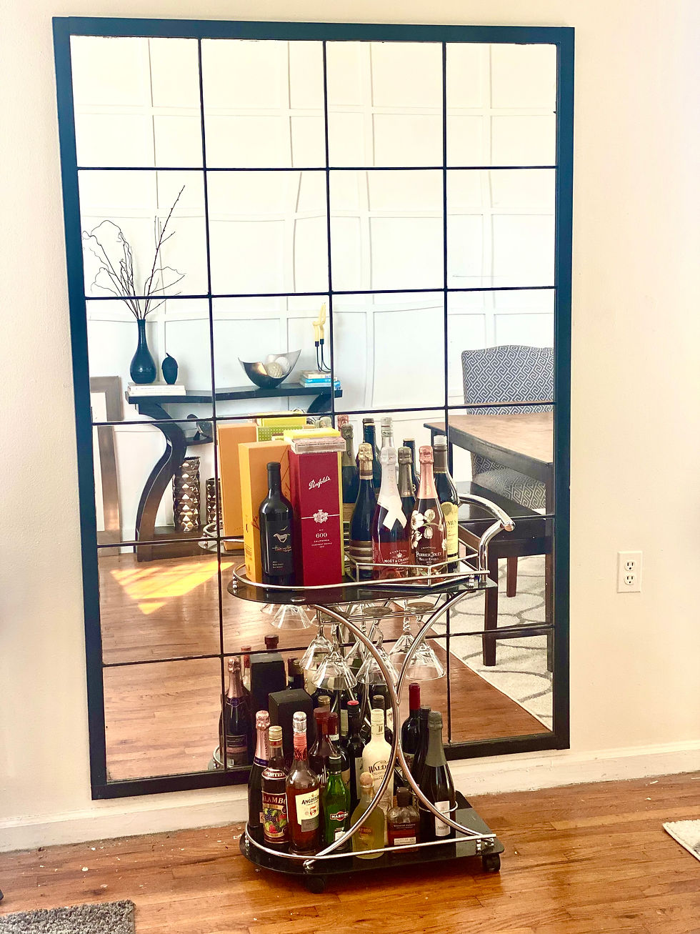


Why does a large mirror make a room larger?


A large mirror makes a room look larger because it creates an illusion of depth. It tricks the eye into thinking there is more space than there really is. The optical illusion occurs as the mirror reflects light and color across the room. Our eyes perceive the bouncing reflections as increased volume, making the room look bigger.


So I decided to make a mirror tile wall.


I picked the wall that faced my board & batten accent wall. It's the wall that connects my living room and dining room and I wanted it to give an optical illusion that it looks a lot wider than it really is.


First, I took down the floating shelves that I used to have on that wall. Then I spackled all the holes left from the nails that held the shelves.


I sanded and painted the whole side of the wall where I will be installing my mirror tile wall . I wanted it to look really bright so I settled for a regular white Benjamin Moore regular semi-gloss paint.


I ordered 12" x 12" mirror tiles from Ikea which came 4 in a pack for $9.99. Each pack came with two-sided adhesive tapes . To make the mirror stick better I bought 3M double sided tape and cut (1) inch tapes and stuck them to the back of the mirror before adhering them to the wall. This way even if the summertime brings moisture to the wall it wouldn't be a problem.


I wanted 4 mirror tiles horizontally and 6 vertically which I separated with the use of wooden dowels that I picked up from the Dollar Tree.


I painted the wooden dowels using black acrylic paint from Michael's. I let them dry and did a second coat.


I used nail glue to put the painted towels in between the mirror tiles. I held each dowel for a few seconds to make sure that they're completely adhered & secured on the wall before I put the next one.


I had left over MDF primes from my first board & batten wall so I used them to frame the mirror tiles. This would make everything look like it's one piece. I measured how much I needed for each side, spray painted them black, used nail glue to adhere them to the wall and caulked to make everything look cohesive.


Would you try doing this yourself? It's fun and easy and gives you an illusion that you have so much space than you really do.


Updated: Dec 8, 2022

I am obsessed with accent walls. I love adding architectural designs to any plain wall. Not only is it such an easy DIY project, it also creates so much character by simply adding a little of bit of wood or some paint.


With wainscotting, strategic panels can break up the look of plain walls, and add visual interest to any room. I can't really say that my entryway is completely boring. It had a little bit of a character after adding the console table and a mirror but I got tired of it and it needed more function, and style.


With the winter season in full blast, layers and layers of clothing are worn on a daily basis. Not to mention hats, scarves, gloves, etc. So I decided to make the entryway somewhat functional where all these can be stored but hidden but also make a little bit of statement as soon as you walk in the door.


I didn't want to spend a lot of money and I love to upcycle. So I used my daughter's old crib, that I already previously upcycled to use as a ladder for the custom bed I made her (will work on putting that post next) which was a complete fail and some scrap wood I had from other projects.


I, then, cut each rail so I can use them as my panels for the purpose of wainscoting.


I used my nail gun to attach them to the wall and spackled any holes and imperfections on the wood. This would make it easier once you start painting.


NOTE: Please make sure that you do your measurements prior on where you want to put your panels.


Then I added a shelf.


I painted everything first around the panels white so the entryway would look really fresh then painted my panels a gray color. I used Benjamin Moore Iron Gate 1545.


Now the fun part, decorating.


I bought coat hooks and installed them evenly on the panels. This is where the jackets and coats and hats can be hung.


I mentioned that I didn't want to spend a lot of money so I went to Craigslist to see what I can find as far as storage is concerned and I found this 3-cube storage bench from a seller who is moving out of town. It was brand new. It just didn't come with the storage cubes that were in the photo. Not sure if the seller used them but I just bought some from Target after measuring the exact size that I need.


I love everything about this bench but the brown fabric of the cushion wasn't doing it for me. So I changed it.


And this is the end product. What do you guys think?


CONTACT

bottom of page